What I’ve noticed, working as banking digital channel manager for many years, is that mobile banking users have incomparably more monthly logins than Internet banking users. On average mobile banking users login at least once in every two days, while significant percentage login once or more per day, that’s a lot comparing it to Internet banking where users would usually login just a few times per whole month!
And login process, depending on authentication method, usually is not that super quick and practical.
So what if you are just passing over shopping window and spotting great pair of shoes and you don’t how know exactly your finances are doing and whether you can afford these? You would normally get your smartphone, find your mobile banking app, open it, log in and browse to your account balance functionality. But all this takes time, maybe 20, 40, 60 seconds or even more, and in most cases, you just want to get your balance of current account?
What if there could be, maybe less precise, but instant overview of your balance?
Wouldn’t it be nice if you could get this insight in just few seconds, and that you can immediately spot that new incoming payment or salary? Even without username / password or PIN (or whatever your app uses)?
The key is in relative values
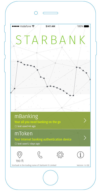
One of the solutions would be to present a simple line chart, on very first screen of the mobile banking app, that has no numbers and which shows current (or, basically, any chosen) account balance daily history represented in user defined upper and lower limit values. This means that only after knowing these limit values a chart without marked numbers has some real meaning or insight value.
Here also, the chart is effectively camouflaged into to the design of the app making it even more less intrusive but certainly there could be other creative solutions, depending on the design theme of the hosting app, achieving same effect.

The upper and lower limits can be any values, as shown here -2.000 to 6.000 or, say, 0 to 16.000 or maybe 3.000 to 5.000 which all have their individual understanding of the chart. Grid lines shown here can also be applied on actual chart as a user selectable option.
Furthermore, an upper and lower limit values can also be configured as auto-adjusted values based on, for example, user’s last 3 months average highest and lowest account balance value which makes chart even less number specific and also less revealing but still useful visual insight on how user’s finances are doing (and whether he is closer to top or bottom of his custom scale).
Security wise, all the values sent to the app are in relative values rather than the actual absolute account balance values meaning that no real information leakage can occur, which is quintessential for every bank.
Just one swipe away
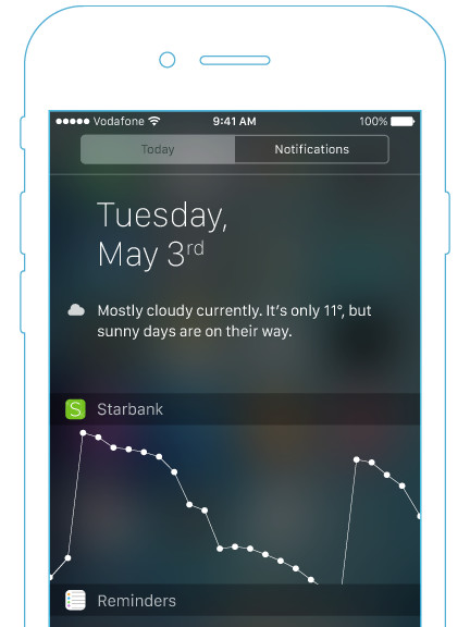
Also, the same graph, meaningful to user, can be applied, for example, as iOS widget. That means that user doesn’t even need to find his app and open it, but rather just swipe from the top of the screen!
Finally, graph can even include small indicator showing how fresh data is and also user-defined “safe-to-spend” line (both here not shown) so that user can even more precisely see if one is above or below.
Final word
Today modern banks are increasingly becoming synonym with mobile banking app. More so now that there are new generation of banks that are only mobile app focused. With that in mind, it is essential that all banks are pushing their creative solution for the benefit of best possible user experience of their clients. This is one small, I believe original, idea in making best use of our mobile banking daily experience. To find more about my 15 years in product management take a look at my Product management portfolio.
Please feel free to comment how do you like idea or even possibility to extend it.